454 Grill Identity Refresh
If you’ve ever been in a layout wrestling match with an unbalanced logo, you’ll know why 454 Grill approached us for an identity refresh. The food truck itself needed to remain in the logo—the engine model is part of the name, after all. But, the illustration combined with the small type created too many challenges in layout. Restructuring the logo wasn’t our only task: 454 Grill also needed a quick ship brand kit to guide their design choices toward a more cohesive suite of materials—starting as soon as possible for the new year.
We’ve got car nerds on our team. If you share their love of all things motors, we’ll do you a favor and highlight 454 Grill’s engine story. They were a day away from finalizing their permit when the engine blew. But they rallied the troops and finished a complete rebuild of the truck’s 454 big-block in less than 60 working hours. After that, they knew that 454 was part of the name.
Rebuilding the Logo
First up was evaluating the content of the logo. Including a business location in a logo is often superfluous. Location is going to come up in written materials. Not only that, but the nature of 454 Grill’s business is mobile. Their market includes other cities and areas outside of Raleigh, as well. All the better for us to leave the location out of the lockup: It’s one less element to squeeze in and one less element to hinder scalability.
Next came font tests. We adjusted the balance of type to make the name more visible, keeping “454” as the most prominent element, with “Grill” right behind it in the hierarchy. We worked through several options, ultimately landing on a mix: A blocky, angled sans-serif font for “454,” akin to type styles typically seen on vintage automobiles, and an equally retro, sign painter-style script for “Grill.”
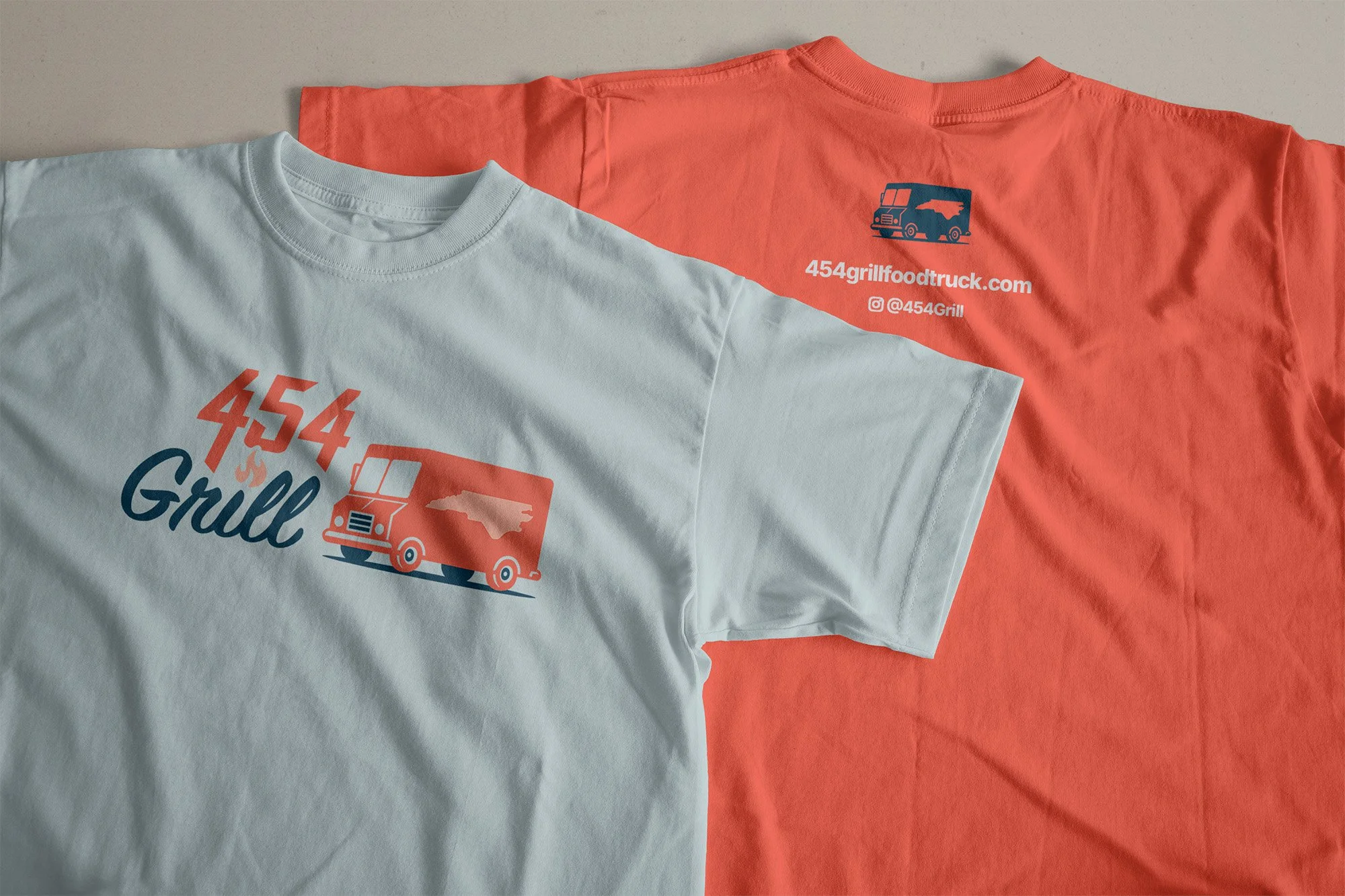
We used smaller details to add dimension and create connection between the contrasting styles of the type-only version of the logo. We replaced the dot of the “i” in “Grill” with a flame—overlapping the text just slightly. Another example is the tailored fit of the “454” letterforms that let it nest neatly into “Grill”—and the angled cutoffs that nod to exhaust pipes. Our philosophy is that every brand kit needs a type-based version of the logo for maximum design and production flexibility. These design choices ensured the type-based versions of the 454 logo would be (almost) as fun as versions including the truck.
With logotype arrangements in place, we simplified the truck: No more tilt to the design. Instead, arranging everything on a flat, horizontal plane meant it would be easier for the 454 team to deploy the new logo options in their materials.
We then produced a variety of lockups with the truck alongside the logotype—all set in two colors. A two-color strategy helps nearly any brand: First, you can move swiftly into print with fewer hassles. For example, if you need to print a window decal or a shirt, two ink colors is a common cap for cost-efficient printing. Second, logo art shouldn’t be so detailed as to distract from the brand name. Keeping the entire logo to only two colors (and tints for detail) creates focus on the total sum of the brand—not just one specific element of the logo.


Before & After: The original logo (left) and new primary logo (right).


The new logo kit is modular. It includes a horizontal version, text-only versions, and truck-only versions.
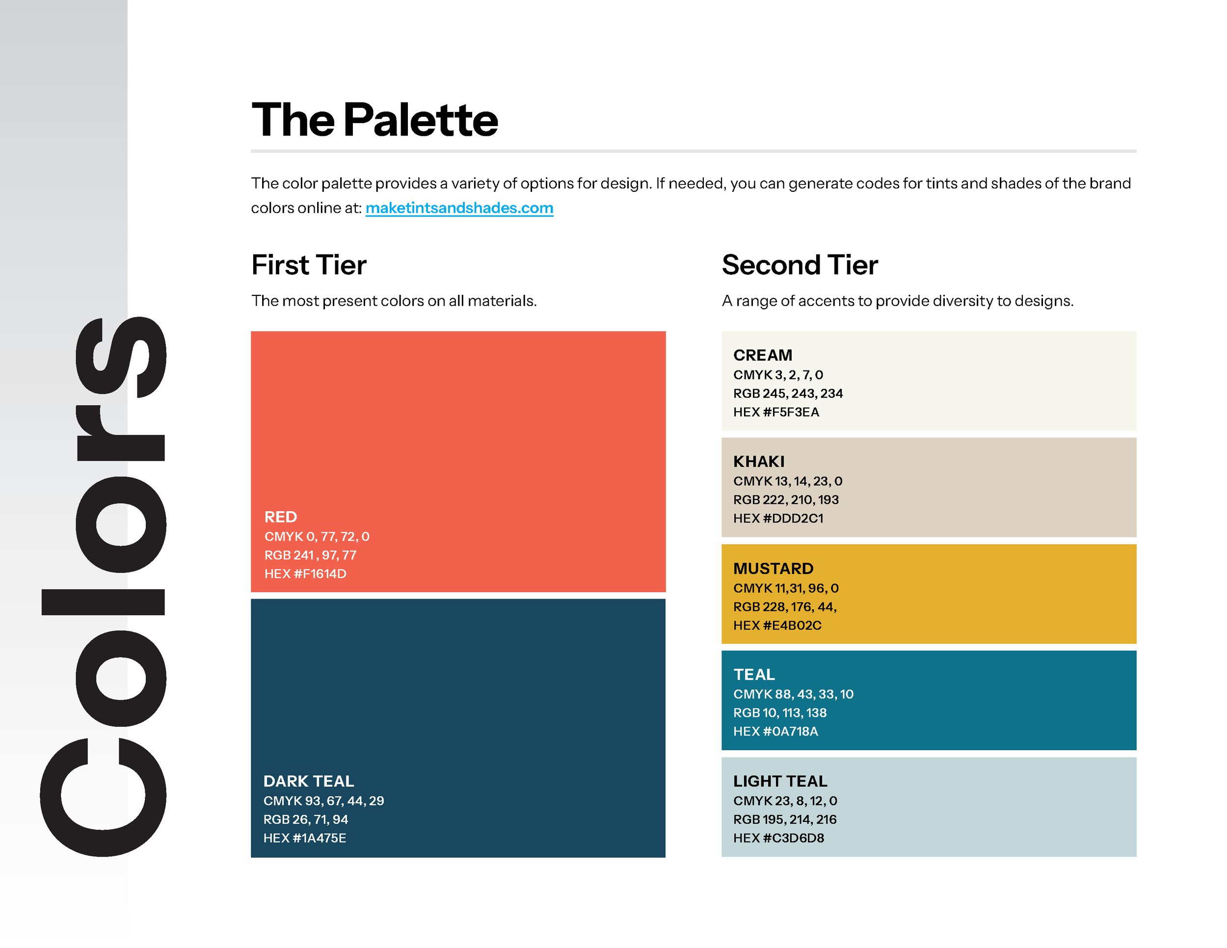
Extending the Color Palette
There’s more to creating a successful brand than a solid logo design. It’s also about defining elements to support the logo and create an intentionally coordinated look for the brand identity.
We worked with the 454 team to figure out what colors would be close to the heart of 454 Grill. The primary logo colors were based on the food truck itself: Chevy Orange— a nearly neon red-orange paired with a dark teal for a bit of contrast. We didn’t want to veer too far from the primaries on the extended palette, considering our goal of making it easier for the 454 team to design materials. So, we extended the primary colors to provide more range and saturation than their default tints, neutrals to give rest to the eye, and a punchy accent color to highlight small design elements as needed. (The latter was mustard yellow, naturally.)
Defining Collateral Type
Did you know that designs don’t have to use an exact match to the fonts in the logo? It may initially seem unintuitive, but fonts are all designed to fill different purposes. Some fonts perform best at a large scale, and others perform best at a small scale. Sometimes, calculated contrast serves designs well; other times, a near-match will be a better fit.
For 454 Grill, we split the difference. We selected a script for headings with a short word count, between 1-3, maximum. It’s similar to the ‘Grill’ font, but more readable at a small scale. Still, we needed a word count cutoff to prevent script use on long-form text. (Scripts are great as accents, but almost none are quick to read in sentences.) Everything else would be set in a clean, easy-to-read sans serif. This combination injects brand personality into top-level headings without sacrificing readability overall—which is important for materials that will likely feature small font sizes, like menus.
The Results
The 454 Grill team is excited to roll out their new branding in 2025, and we look forward to seeing where they take it from here.
Final thoughts from 454:
We absolutely loved working with HALO 22 for the rebrand of our food truck business! We asked for a brand kit that reflected the character of the food truck, including the 454 Chevy racing engine, and the final product is better than we could have imagined. The HALO 22 team was prompt, considerate, and overall a joy to work with!
—Laura Burkett, 454 Grill
Next time you’re in Raleigh and surrounding areas, be on the lookout for a big, bright truck and brilliant food. And—in between bites—don’t forget to tell them how much you love the brand!

Need help refreshing the look of your brand? Contact us today.